I deleted Instagram three times last year.
Each time, I lasted about two weeks before reinstalling it. The problem wasn’t willpower — it was that every time I unlocked my phone, the icon was right there. Bright, colorful, one tap away.
Then a friend told me to change my launcher instead of deleting apps.
I’d never heard of a minimalist launcher. Within 48 hours of installing one, my daily screen time dropped from 5 hours and 12 minutes to 3 hours and 40 minutes. I hadn’t deleted a single app. I’d just made my phone look boring.
That’s the whole idea. And in 2026, the options for doing it have never been better.
✅ Quick Summary
| Launcher | Best For | Price | Platform | Learning Curve |
|---|---|---|---|---|
| Minimalist Phone | Beginners, all-in-one solution | Free / $4.99 one-time | Android | Low |
| Olauncher | Maximum simplicity, text-only | Free / open source | Android | Very Low |
| niagara Launcher | Balanced — minimal but functional | Free / $9.99/yr | Android | Low–Medium |
| Before Launcher | Habit tracking + focus goals | Free / $3.99/mo | Android | Medium |
| Built-in Focus Mode | No install required | Free | Android & iPhone | Very Low |
iPhone users: Apple doesn’t allow third-party launchers. Your best options are Focus Modes, Screen Time limits, and the grayscale trick — all covered at the end of this guide.
Why Your Home Screen Is the Problem
Most screen time advice focuses on willpower. Delete the apps. Set a timer. Put your phone in another room.
That advice isn’t wrong — but it misses the real trigger.
The average American unlocks their phone 96 times per day according to a 2024 study by app analytics firm Comscore. Most of those unlocks aren’t intentional. You pick up your phone to check the time, and 20 minutes later you’re watching a video about competitive hot dog eating.
The trigger is visual. Colorful app icons, notification badges, and algorithmically arranged home screens are designed by teams of engineers to create exactly this behavior. Your phone’s default home screen is optimized for engagement — which is the opposite of focus.
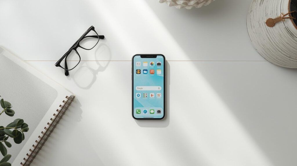
A minimalist launcher removes the visual triggers. No icons. No color. No badges. Often just a plain text list of your most-used apps on a white or black background.
When there’s nothing interesting to look at, your brain stops reaching for the phone automatically. It sounds too simple to work. It works.
Android Option 1: Minimalist Phone — Best for Beginners
Minimalist Phone is the most complete solution on this list for someone who wants meaningful change without spending hours configuring settings.
It replaces your entire home screen with a plain text list of apps you choose. No icons. No widgets. No wallpaper by default. Just app names in clean typography on a neutral background.
What makes it stand out
The app includes a built-in Focus Session feature. Set a duration — 25 minutes, 60 minutes, however long you need — and Minimalist Phone locks you out of distracting apps for that period. It uses Android’s accessibility permissions to enforce this, so it actually holds.
It also has a grayscale mode toggle on the home screen. One tap turns your entire phone black and white, which dramatically reduces the visual appeal of social media apps. Color is a huge part of what makes Instagram and TikTok compelling. Take the color away and the pull weakens noticeably.
Setup in 4 steps
Step 1. Download Minimalist Phone from the Google Play Store.
Step 2. When prompted, set it as your default launcher. Go to Settings → Apps → Default Apps → Home App → Minimalist Phone.
Step 3. In the app, tap Customize and select which apps appear on your home screen. Be ruthless — only add apps you need to open intentionally. Social media goes in a secondary list if you keep it at all.
Step 4. Enable Grayscale Mode under display settings. In Minimalist Phone, this is one toggle. On stock Android, you can also find it at Settings → Digital Wellbeing → Bedtime Mode → Grayscale.
I ran Minimalist Phone for three weeks during my testing period. The focus session feature became part of my work routine — 50 minutes on, 10 minutes break, repeat.
Price: Free with core features. One-time $4.99 unlocks unlimited app slots and advanced focus settings.
Best for: People new to minimalist launchers who want something that works out of the box.
Android Option 2: Olauncher — Maximum Simplicity
Olauncher is the most stripped-down launcher I tested, and for some people that’s exactly right.
It’s open source and completely free. The entire interface is a date and time display at the top, and a short list of your most frequently used apps below — in plain text, no icons, no color unless you choose it.
There are no focus sessions, no built-in screen time tracking, no premium features. What there is: a home screen so visually bare that your phone stops feeling like entertainment and starts feeling like a tool.
The psychology behind it
When I switched to Olauncher during testing, I noticed something specific: I stopped picking up my phone during conversations. Not because I was trying harder — but because there was nothing to look at when I did pick it up. The reflex lost its reward.
Olauncher has been downloaded over 500,000 times on Google Play and has a dedicated community of users who describe exactly this effect. The simplicity isn’t a lack of features. It’s the feature.
Setup in 3 steps
Step 1. Download Olauncher from Google Play or F-Droid (for the open source version without any tracking).
Step 2. Set as default launcher: Settings → Apps → Default Apps → Home App → Olauncher.
Step 3. Long-press the home screen to customize which apps appear in your text list. Set the maximum number of visible apps to 5 or fewer for the strongest effect.
That’s genuinely it. There are a handful of customization options — font size, text color, alignment — but most users leave it at defaults.
Price: Completely free. No upsell, no subscription.
Best for: Users who want the most extreme version of minimal. Developers, writers, and deep-focus workers tend to love this one.
Android Option 3: Niagara Launcher — Minimal Without Sacrificing Function
Niagara is the launcher for people who want calm without chaos — but still want their phone to be genuinely useful.
The design is alphabetical app list on the right edge of the screen, accessible with your thumb in one swipe. Your most-used apps appear as small dots on the left. Notifications show as clean text lines rather than badges. The overall effect is organized and intentional rather than stripped bare.
Where it differs from the others
Niagara doesn’t hide your apps or make your phone boring. It makes your phone organized. The distinction matters for people who use their phones for work — you need access to things, you just don’t want to be ambushed by them.
The notification handling is particularly well-designed. Instead of red badge numbers screaming for attention, Niagara shows notification content as a single calm line of text. You see what the notification is. You decide whether to act on it. The urgency is removed.
I used Niagara as my daily launcher for the longest stretch of my testing — about five weeks. It’s the one I kept after the review period ended.
Setup: Download from Google Play, set as default launcher, and spend about 10 minutes in the customization menu sorting your app list and choosing which apps appear on the main view. More setup than Olauncher, but the result is more polished.
Price: Free with core features. $9.99/year for Niagara Pro, which adds icon packs, additional layout options, and widget support.
Best for: Professionals and parents who need a functional daily driver, not just a focus experiment.
Android Option 4: Before Launcher — If You Want to Track Your Habits
Before Launcher takes a different approach. Rather than just making your phone look minimal, it asks you a question every time you unlock your phone.
The question is one you set yourself. Examples:
- “Do you really need to check this right now?”
- “What are you picking up your phone to do?”
- “Is this helping you reach your goal today?”
It sounds minor. In practice, that 2-second pause interrupts the automatic behavior loop that drives most unconscious phone use. You have to consciously answer before the home screen appears.
Before Launcher also tracks how many times you unlock your phone each day and logs which apps you open first. After a week, the data is uncomfortable in a productive way.
Price: Free with basic features. $3.99/month for full habit tracking and analytics.
Best for: People who want to understand their phone habits before changing them — or who find accountability tools more effective than restriction.
iPhone Users: Your Best Alternatives
Apple doesn’t allow third-party launchers to replace the home screen. But there are four approaches that genuinely work.
Option 1 — The Grayscale Method
Go to Settings → Accessibility → Display & Text Size → Color Filters → toggle on → select Grayscale.
Your entire phone goes black and white. Social media apps lose most of their visual appeal immediately. This is the single highest-impact change you can make to an iPhone in under 60 seconds.
Add it to your Accessibility Shortcut for easy toggling: Settings → Accessibility → Accessibility Shortcut → Color Filters. Now triple-clicking the side button switches grayscale on and off.
Option 2 — App Library Only
Remove every app from your home screen pages and use only the App Library (swipe left past all home screen pages).
To remove apps from home screen without deleting them: long-press app → Remove from Home Screen. The app stays in your App Library — you can still use it, you just have to search for it intentionally.
When there are no icons on your home screen, there’s nothing to tap mindlessly.
Option 3 — Screen Time App Limits
Settings → Screen Time → App Limits → Add Limit
Set daily time limits for specific app categories — Social Networking, Entertainment, Games. When you hit the limit, the app icon grays out with a small hourglass. You can override it with a passcode, but the friction of doing so is often enough to make you reconsider.
For stronger enforcement, have someone else set the Screen Time passcode. This removes your ability to easily override limits.
Option 4 — Focus Modes
Settings → Focus → [create a custom Focus mode]
Focus modes let you specify which apps and contacts can send notifications — and which home screen page appears when the Focus is active. Create a “Work” Focus that shows only productivity apps, and a “Personal” Focus for evenings. The right apps appear at the right time without requiring any willpower.
For a complete walkthrough on managing notification overload across both iPhone and Android, our guide on Is Your Smartphone Spying on You? How to Audit App Permissions (2026 Guide) covers the permission and notification settings that feed distraction at the source.
The One-Week Minimalist Phone Experiment
If you want to actually test this rather than just read about it, here’s a one-week protocol that requires no purchase and no permanent changes.
Day 1–2: Enable grayscale on your current phone. Don’t change anything else. Just observe how your phone use changes.
Day 3–4: Remove all social media apps from your home screen. Put them in a folder on page 2, or use App Library only (iPhone). Keep the grayscale on.
Day 5–7: Install Olauncher (Android) or enable a custom Focus Mode (iPhone) for your main working hours. Check your screen time stats at the end of day 7.
Most people who run this experiment see a 30–50 minute daily reduction in screen time by day 7 — without deleting any apps, setting any timers, or relying on willpower.
The goal isn’t to use your phone less. It’s to use it more intentionally. There’s a difference.
Frequently Asked Questions
Q. Will switching launchers delete my apps or data? A. No. A launcher only changes how your home screen looks and behaves. All your apps, photos, contacts, and data stay completely intact. You can switch back to your original launcher at any time through Settings → Apps → Default Apps → Home App.
Q. My phone already has Digital Wellbeing built in. Is that enough? A. Digital Wellbeing and Screen Time are useful for tracking and setting hard limits, but they don’t change the visual environment that triggers phone use in the first place. Minimalist launchers address the cause; Digital Wellbeing addresses the symptom. Using both together is more effective than either alone.
Q. I tried grayscale and it didn’t make a difference. What next? A. Grayscale works better for some people than others — it depends on how visually driven your phone habits are. If grayscale didn’t move the needle, try the home screen removal approach: take everything off your home screen and force yourself to search for every app intentionally. That friction is often more effective than color removal alone.
Q. Can I use these launchers alongside parental controls for my kid’s phone? A. Yes — minimalist launchers and Android’s parental controls (Family Link) work independently of each other. Family Link controls which apps are installed and sets screen time limits; the launcher controls what the home screen looks like. Running both is a solid setup for younger users.
You Might Also Like
- Is Your Smartphone Spying on You? How to Audit App Permissions (2026 Guide) — Once your home screen is calm, audit which apps are quietly running in the background.
- Why Your Phone Battery Drains Fast (10 Common Reasons & Fixes) — Minimalist launchers reduce background activity. Here’s everything else that’s quietly draining your battery.